Project: A centralized dashboard that simplifies government contract discovery, reduces workflow friction, and helps teams act on opportunities with more speed and confidence.
Industry: Federal Government/SaaS
Role: Product Designer
Responsibilities: UI Designer, UX Researcher
Dashboard Design
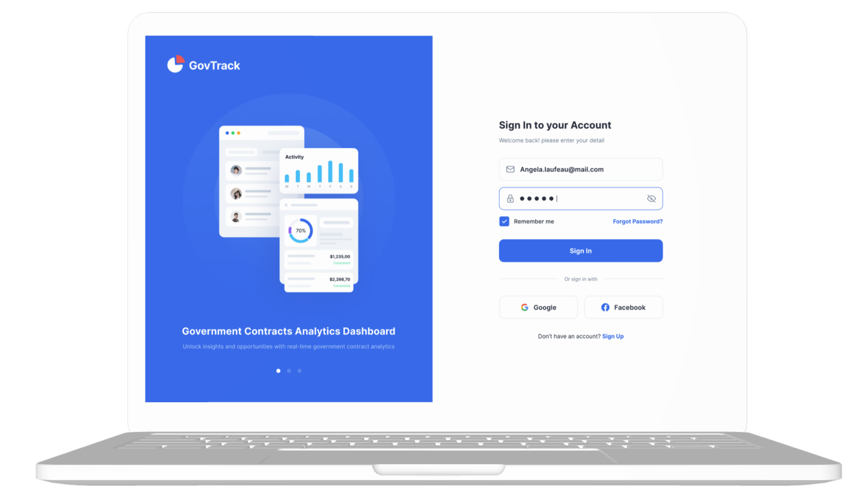
The Opportunity
When I started working on GovTrack, my goal was simple: make it easier for contractors and business development teams to stay on top of government contract opportunities. I designed a web-based dashboard that pulls everything into one place so users don’t have to waste time digging through different portals. The entire experience was focused on speed, clarity, and helping teams make smarter decisions faster.The Problem
Government contract data is spread across multiple portals, making it difficult to access and piece together. Many of these interfaces are dense, unstructured, and hard to navigate, which slows down the process of finding relevant information. On top of that, the lack of real time visibility often causes teams to miss important opportunities. As a result, many organizations rely on manual processes that make workflows inefficient and more prone to errors.The Solution
The platform provides a centralized, real time dashboard that brings together contract summaries in one place. Users can quickly narrow results using interactive filters such as agency, deadline, and contract value. Visual data, alerts, and bookmarking features help streamline the experience and make it easier to track opportunities. Overall, the system is designed to save time and help teams stay more competitive when pursuing contracts.The Research
I used a mixed methods research approach to define the MVP and identify the most important core features. This included surveying more than 150 users and conducting targeted Zoom interviews to better understand workflow gaps and patterns around missed bids.

The insights were mapped in Miro, which revealed a key finding: 76% of users had missed important bids because of poor visibility and scattered information across multiple sources. From this research, several opportunity areas became clear, particularly around improving visibility, enabling better filtering, and helping teams triage opportunities faster.

Based on these insights, we prioritized three MVP features: a centralized dashboard, advanced filtering, and smarter alerts that surface relevant opportunities. The goal was to reduce missed bids and help teams make faster, more confident decisions.
Design Stage
Moved from low-fi wireframes to polished, responsive UIs.Used Balsamiq → Figma with atomic design and 8pt gridConducted Maze testing for feedback loopsEstablished UI patterns early for dev alignment
Designed accessible, action-oriented UIs.WCAG-compliant with contextual CTAs and visual flagsBuilt component library in FigmaFocused on reducing scan time and effort
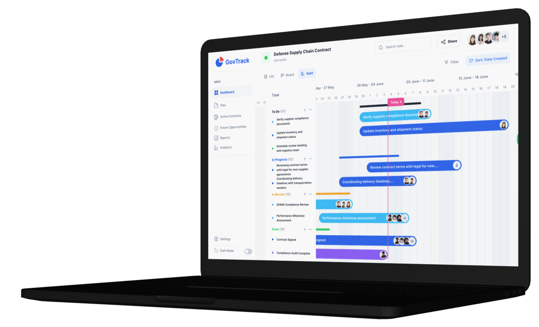
Built a modular dashboard for pipeline visibility and action.Visual analytics, Gantt views, and contract summariesInformed nav via card sortingBalanced clarity, depth, and speed
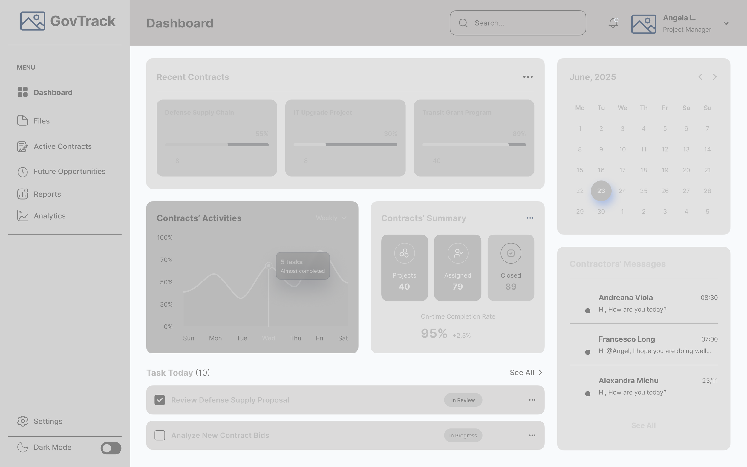
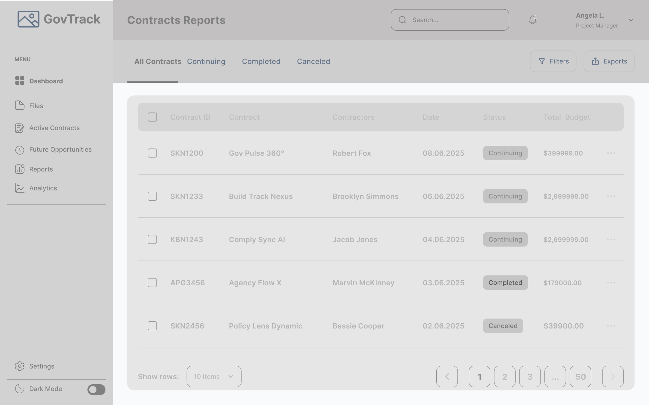
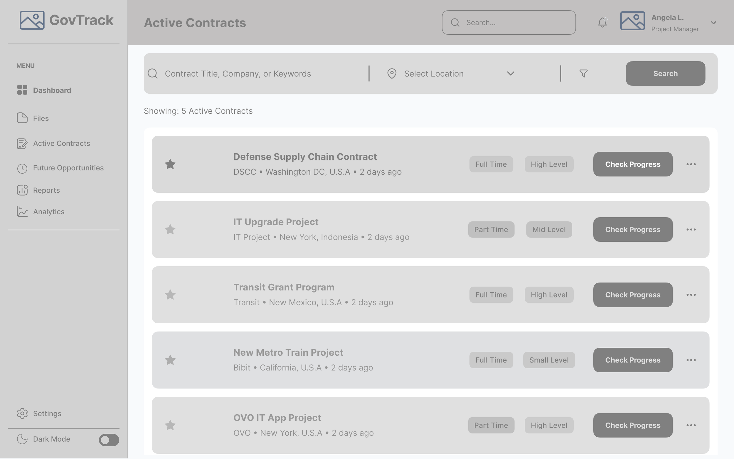
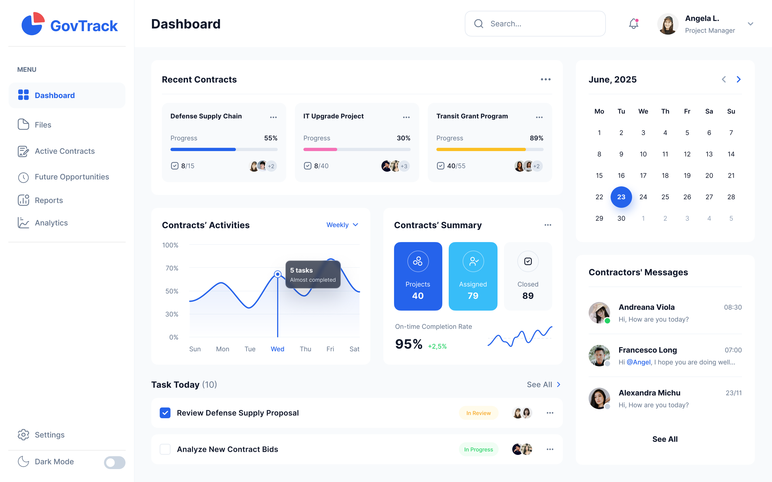
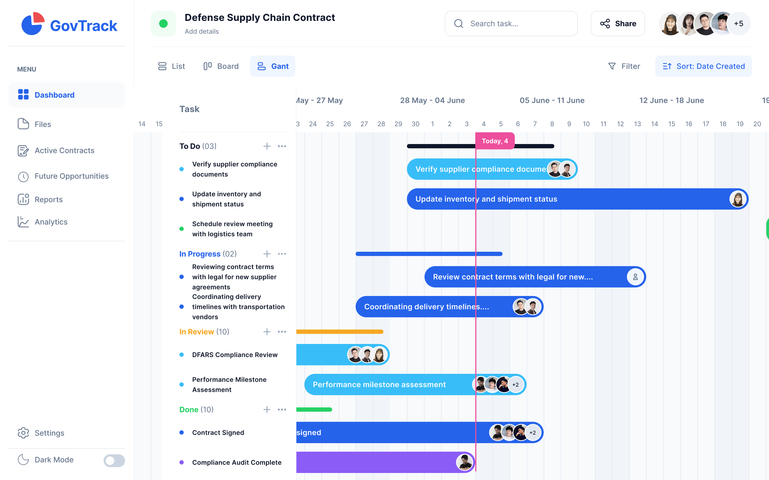
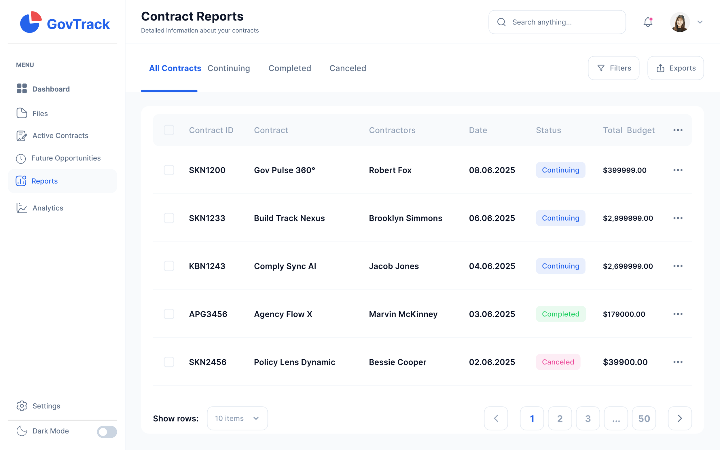
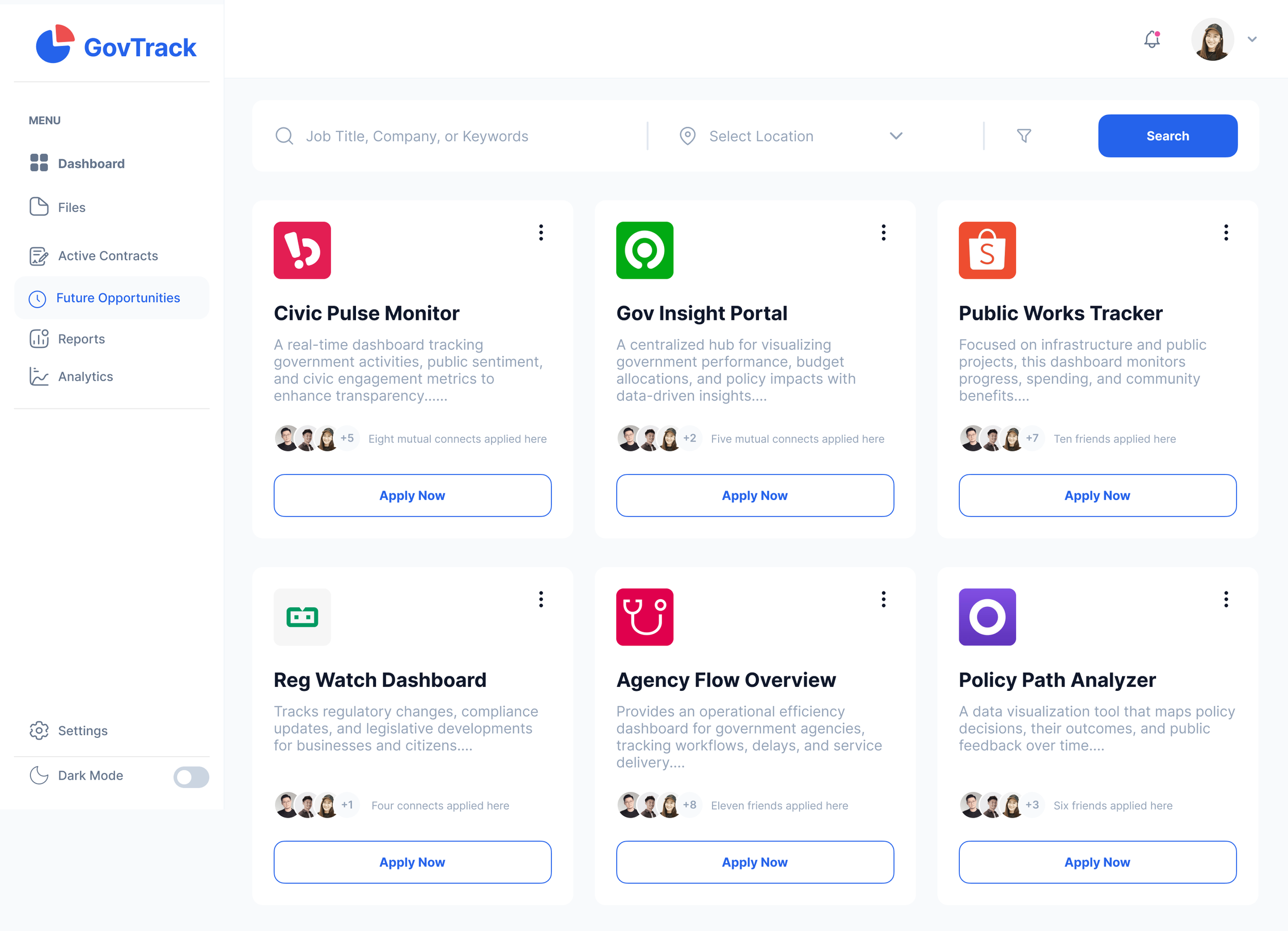
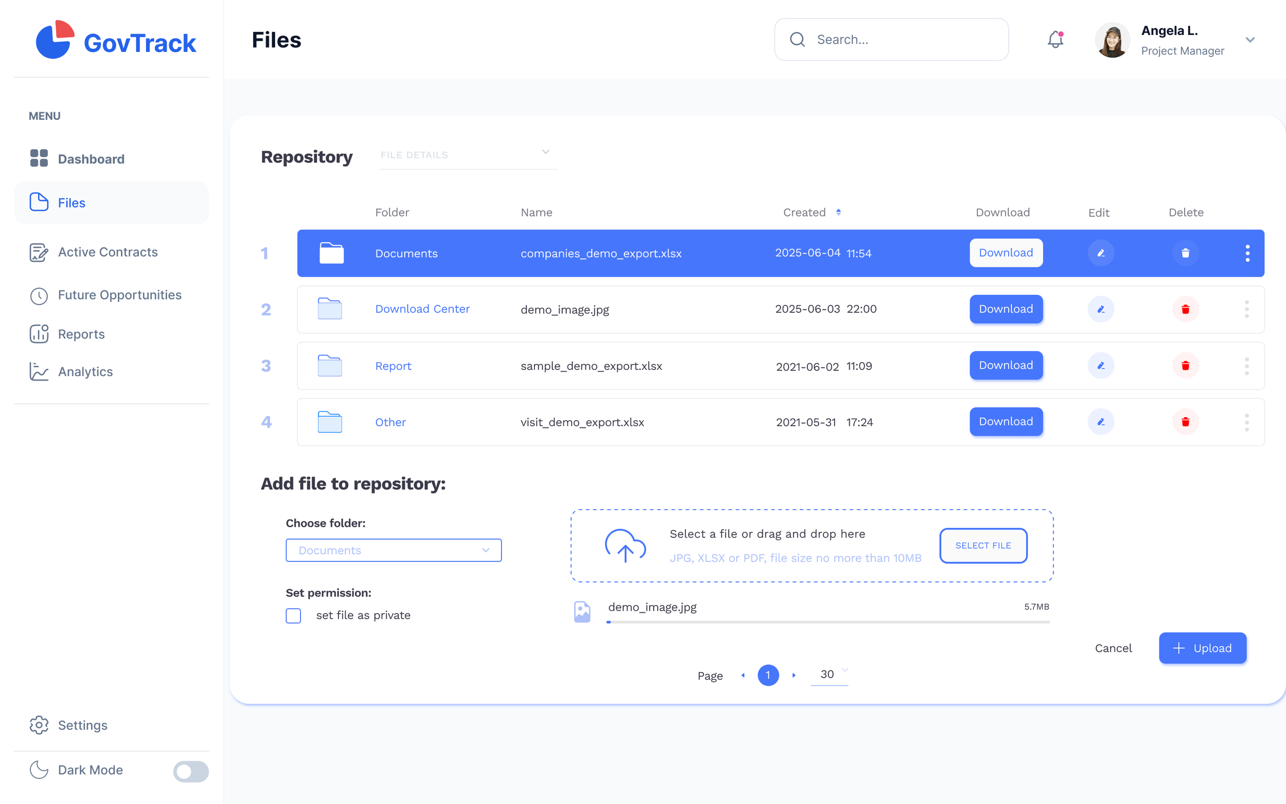
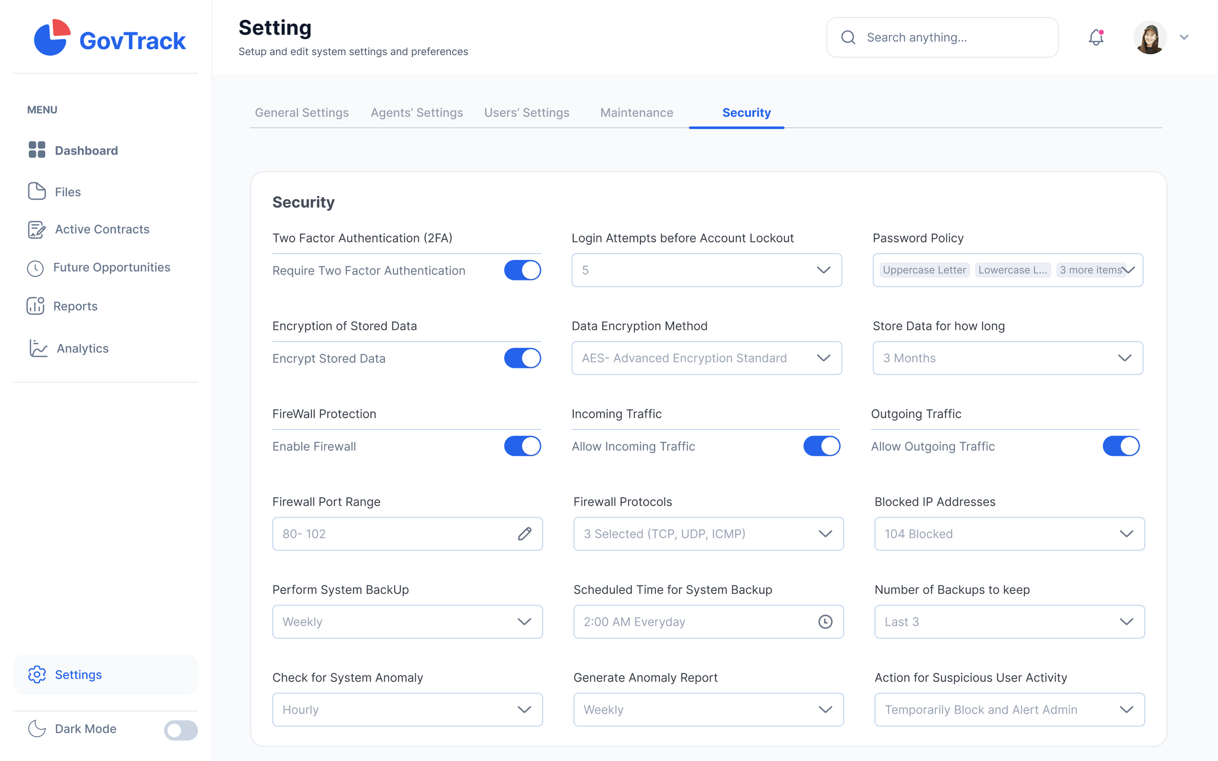
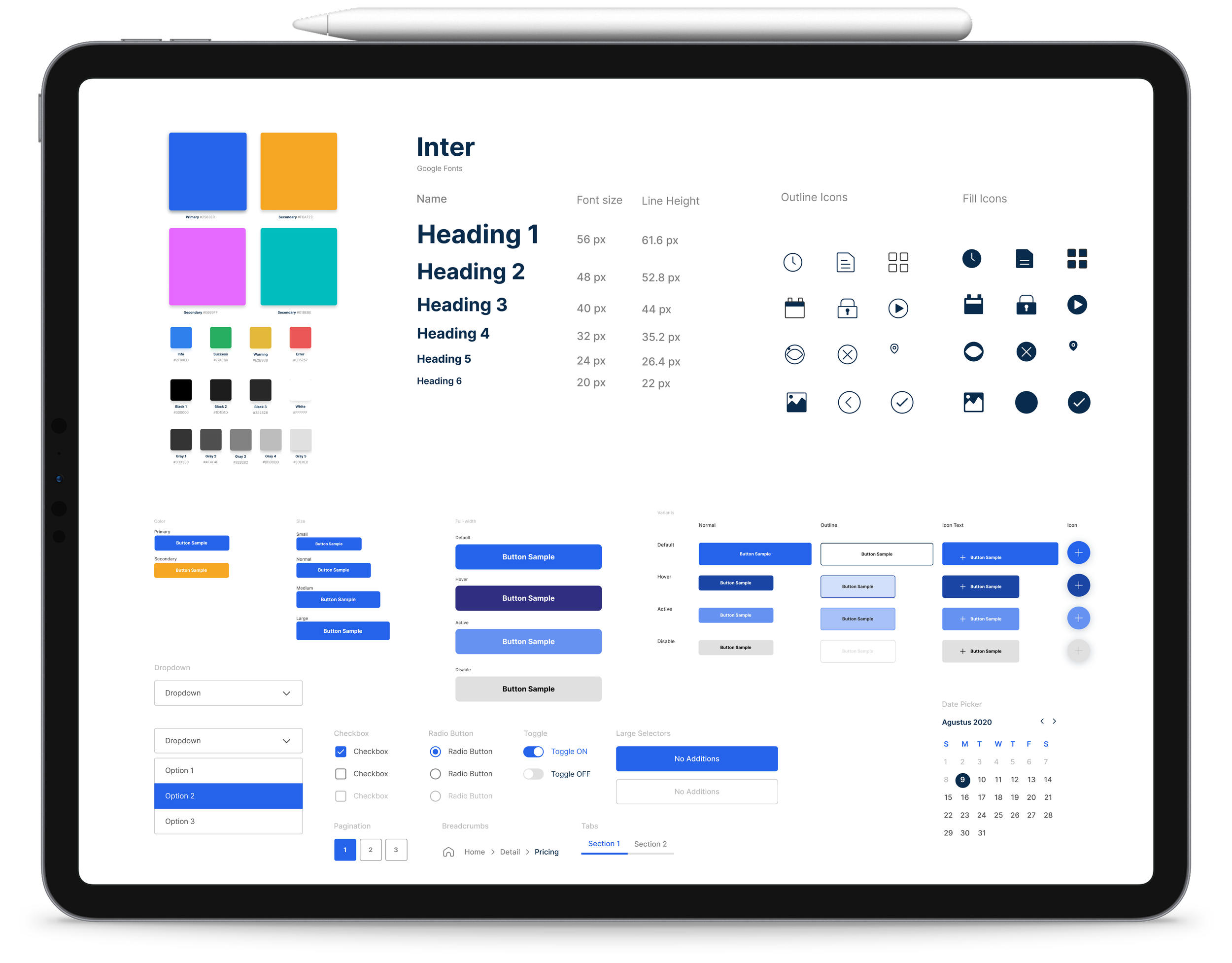
Developed a scalable, token-driven design system for faster dev handoff.Established a fully tokenized foundation for type, spacing, and layout.Implemented WCAG AA-compliant contrast across the UI.Created a comprehensive iconography system with consistent variants.Built reusable component libraries with clear states.Delivered React-ready components aligned with engineering needs.Documented interaction patterns for motion and behaviors.Partnered with product & engineering to audit and migrate legacy UI.Built robust Figma libraries with auto-layout and responsive rules.
Style Guide
The feedback I’ve received from my mentor, peers, and study participants has been overwhelmingly positive. Users have consistently expressed increased satisfaction and ease of use with the redesigned interface.Results & Takeaways
Faster opportunity identificationReduction in manual tracking effortStronger, data-driven bidding strategiesIncrease in visibility into high-value contracts (> $50M)Reduced missed deadlines by 25% through bid closing alertsImproved collaboration across teams via centralized trackingEnabled better resource planning based on future contract forecastsShortened decision cycles for go/no-go bid meetingsIncreased executive visibility into opportunity pipelinesBuilt a scalable framework ready for award tracking and notifications
This project was a valuable learning experience. I gained first hand knowledge of the significance of user-centered design and accessibility. By iteratively refining the design based on user feedback, I was able to improve the overall usability and satisfaction of the final product.