Project: Building a Cohesive Design System and Modernizing the Visual Language
Role: Product Designer
Responsibilities: UI Design
Design System
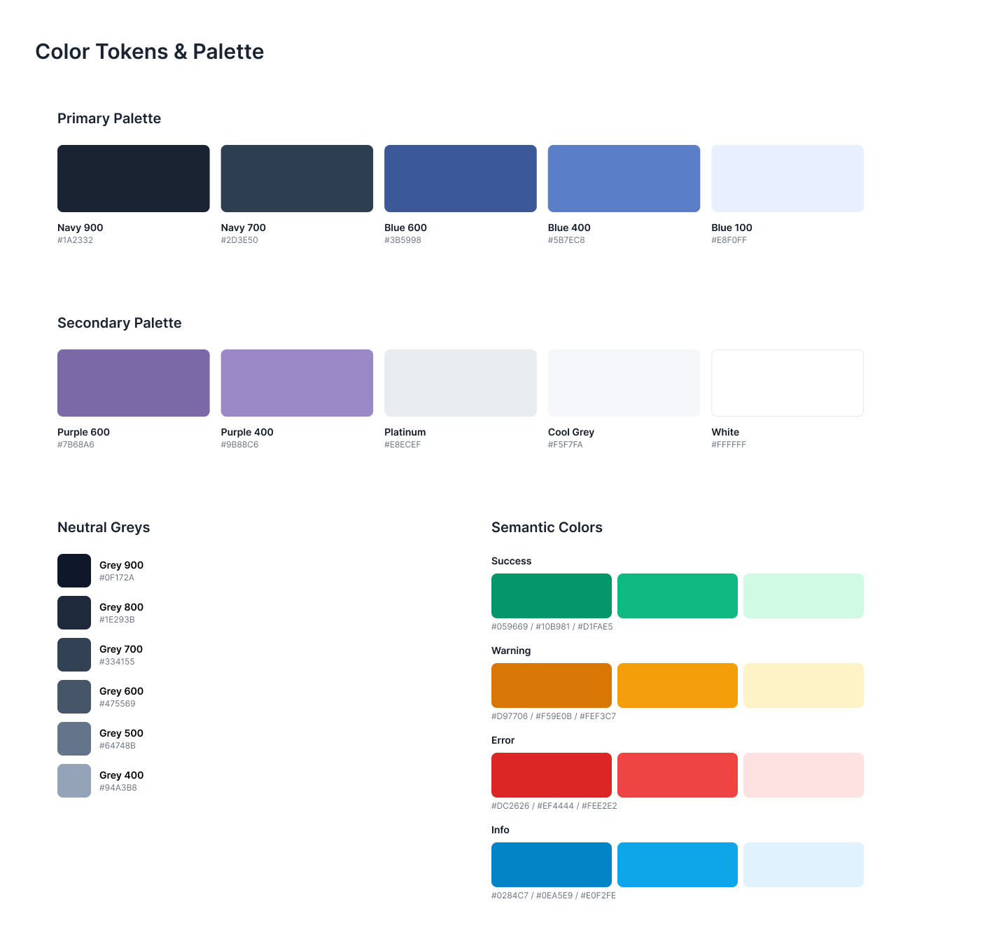
Create a unified design system that standardizes core visual foundations including typography, color, tokens, spacing, grid structure, iconography, and reusable components. The goal is to establish a single source of truth that improves consistency, speeds up production, and strengthens the product’s overall visual identity.
The Opportunity
The product lacked cohesion across screens because there were no shared typographic rules, color standards, spacing scales, or grid guidelines. Designers made layout decisions individually, resulting in irregular spacing, mismatched type hierarchy, and inconsistent use of color. Icons varied in style and weight. Components were rebuilt multiple times because no central library existed. This inconsistency slowed down design and engineering and created a fragmented user experience.
Problem
Develop a foundational design system centered on a clear visual language and structured component library. This included creating a unified typography hierarchy, a streamlined color palette, a token set for all recurring values, a consistent spacing scale, a responsive grid layout, a cohesive icon set, and a shared component library.
Solution
Conducted a full audit of existing screens to identify inconsistencies in fonts, color values, spacing ratios, icon styles, and component patterns. Completed interviews with designers and engineers to understand workflow bottlenecks and alignment issues. Performed comparison reviews of established design systems like Material, Polaris, and Carbon to benchmark best practices for tokens, grids, and components. Insights shaped the rules and structure of the new system.
Research
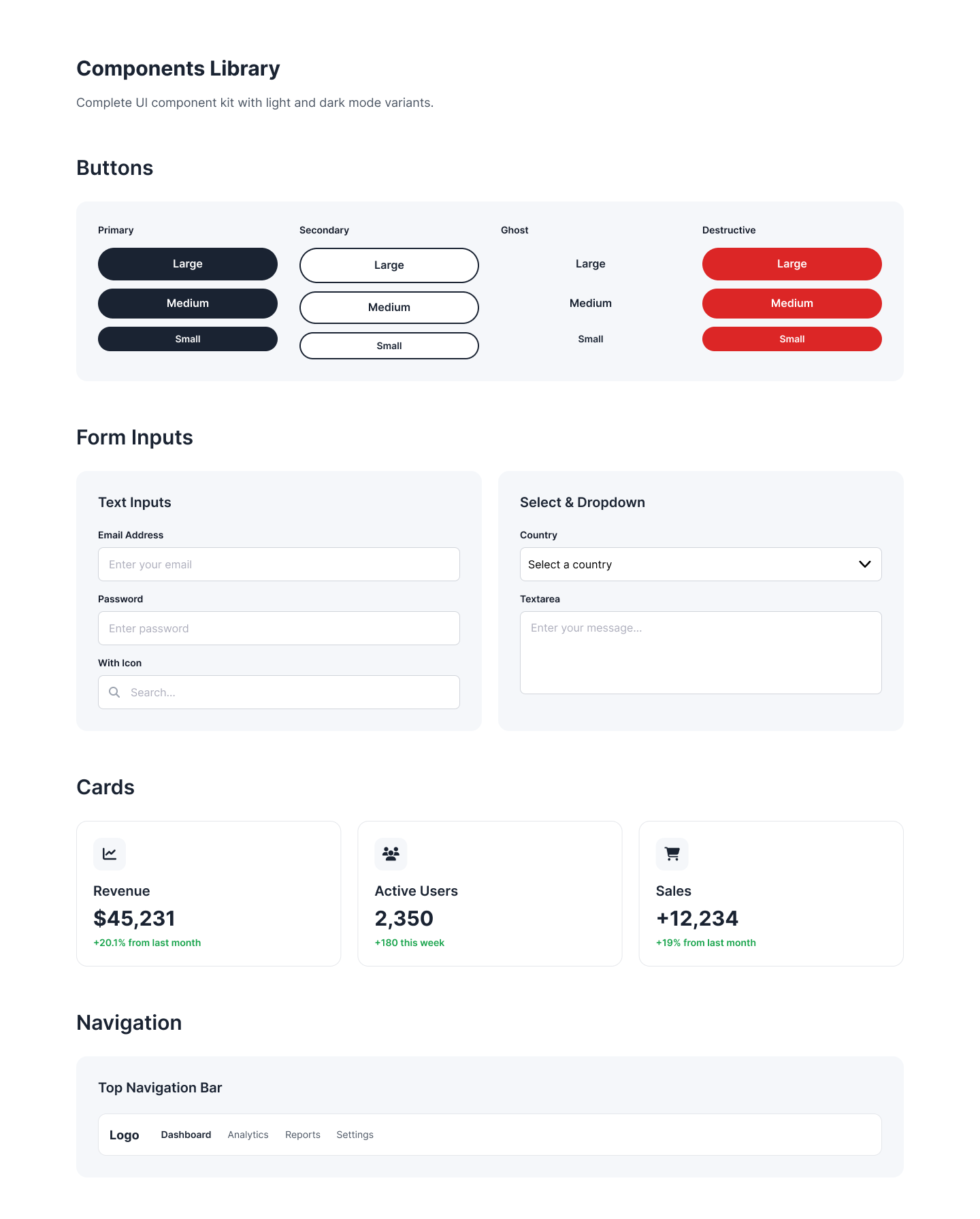
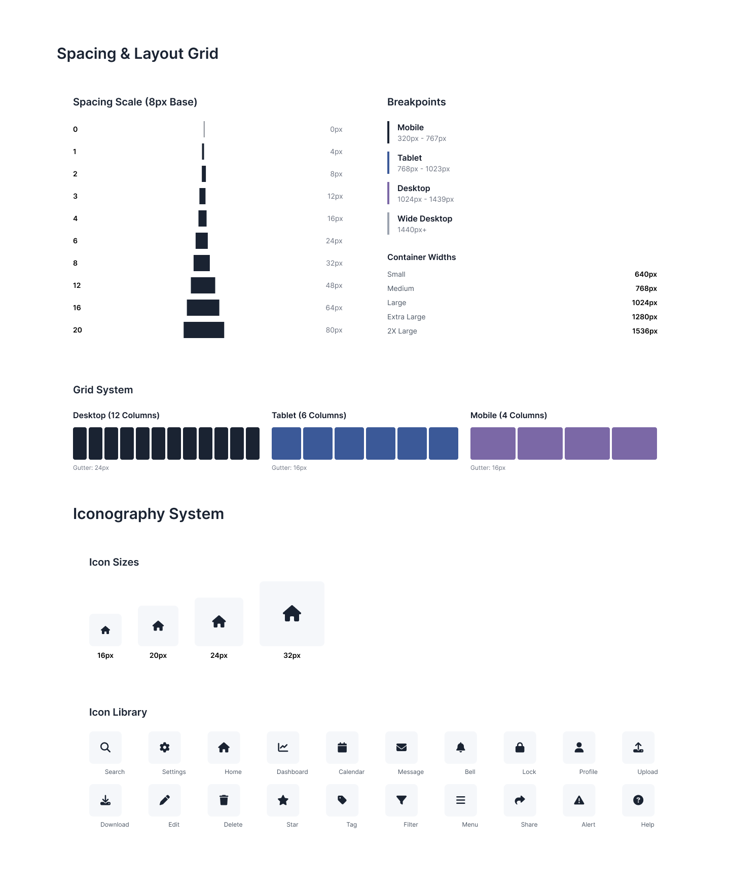
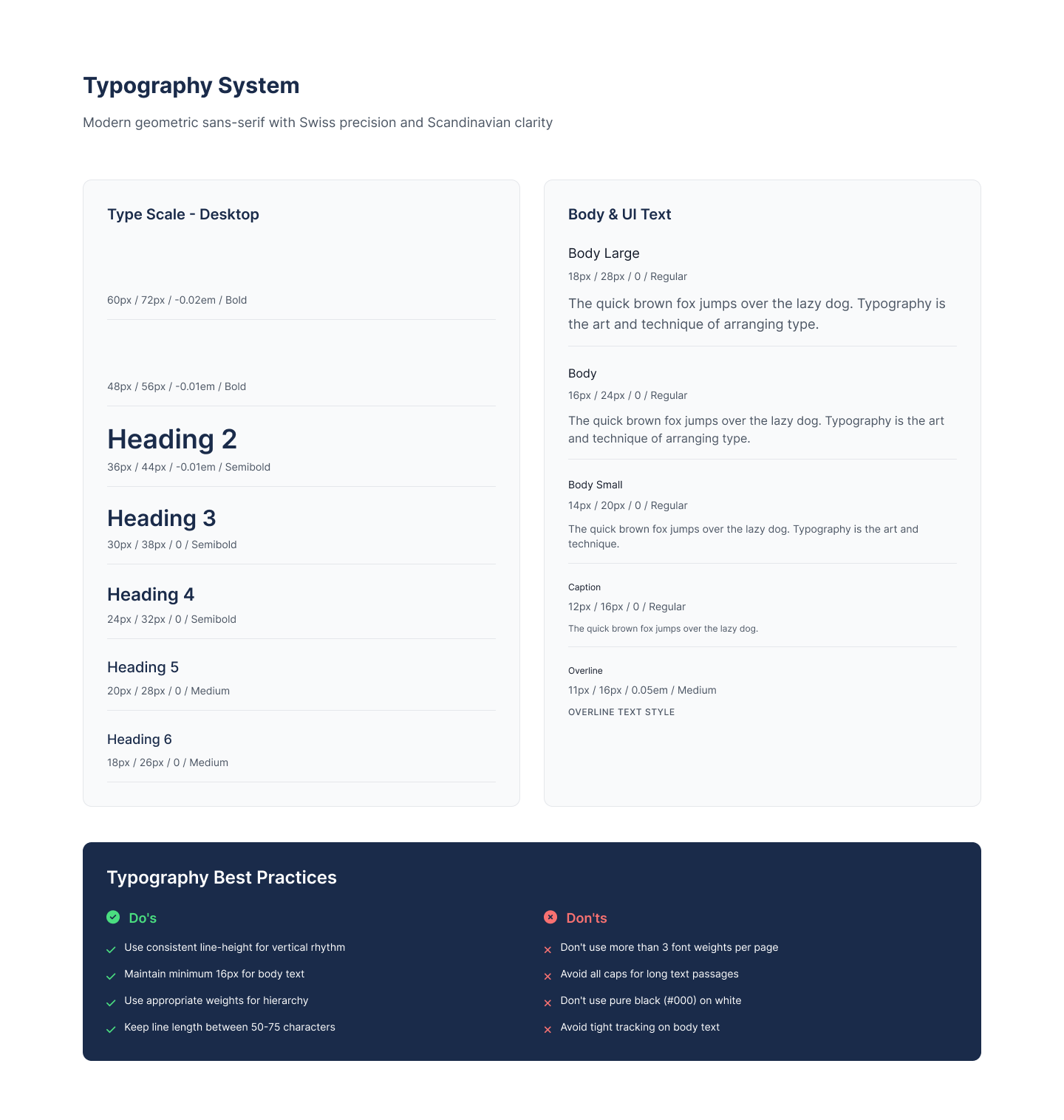
The system improved product quality and team efficiency. Designers now work faster with a clear set of rules for typography, color, spacing, and layout. Engineers rely on unified tokens and components which reduces rework and accelerates implementation. Icons and components look consistent across all platforms. The product now feels cohesive, modern, and easier to scale for future releases.